This week marks three years since we launched Relay FM. Frankly, I cannot believe it has been that long, but as they say, time flies when you're having fun.
We're marking the occassion in a couple of ways this week. The first is a brand new web design. Here's the earliest grab of relay.fm from the Wayback Machine:
That design worked well we had just a handful of shows, but as we approach 30 podcasts, it has been time for a rethink for a while. And what a rethink it is...
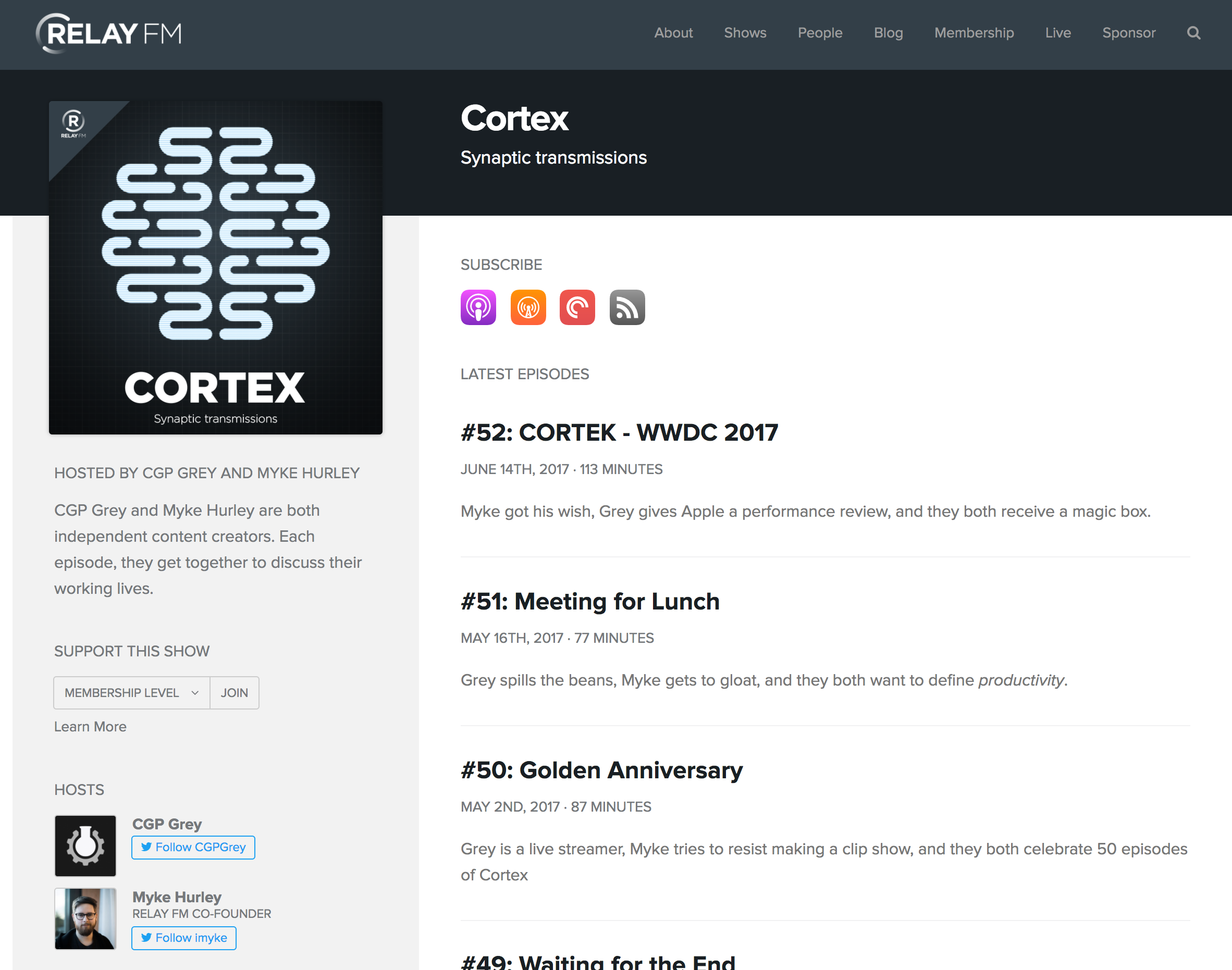
The new homepage features the newest episode in the sidebar, with the next 8 most recent episodes making up the main column. The page uses the color pallette introduced with our iOS app, which really lets the show art pop off the page.
Once inside the site, each show page uses a key color defined by the show art, giving each show and episode a sense of identity and place.
This new design makes it easier than ever to see how to subscribe to a show or support it with a membership, all while letting the content take center stage.
Under the covers, the website still runs atop our custom CMS, which lets us prepare show notes, links and more with ease, even on the go with an iPhone. (You can even do real work in the CMS on an iPad!)
When you visit Relay FM on a mobile device, the site is faster, leaner and much easier to get around.
We owe a huge thanks to the mysterious @forgottentowel, who is the designer behind every single part of the Relay FM brand. That vision was brought to life by Jason Charnes, the developer we work with on the website and CMS.
We hope you enjoy the new coat of paint. There's a lot more to come this week, so stay tuned!


